Brand Development • Business Cards • Merchandise
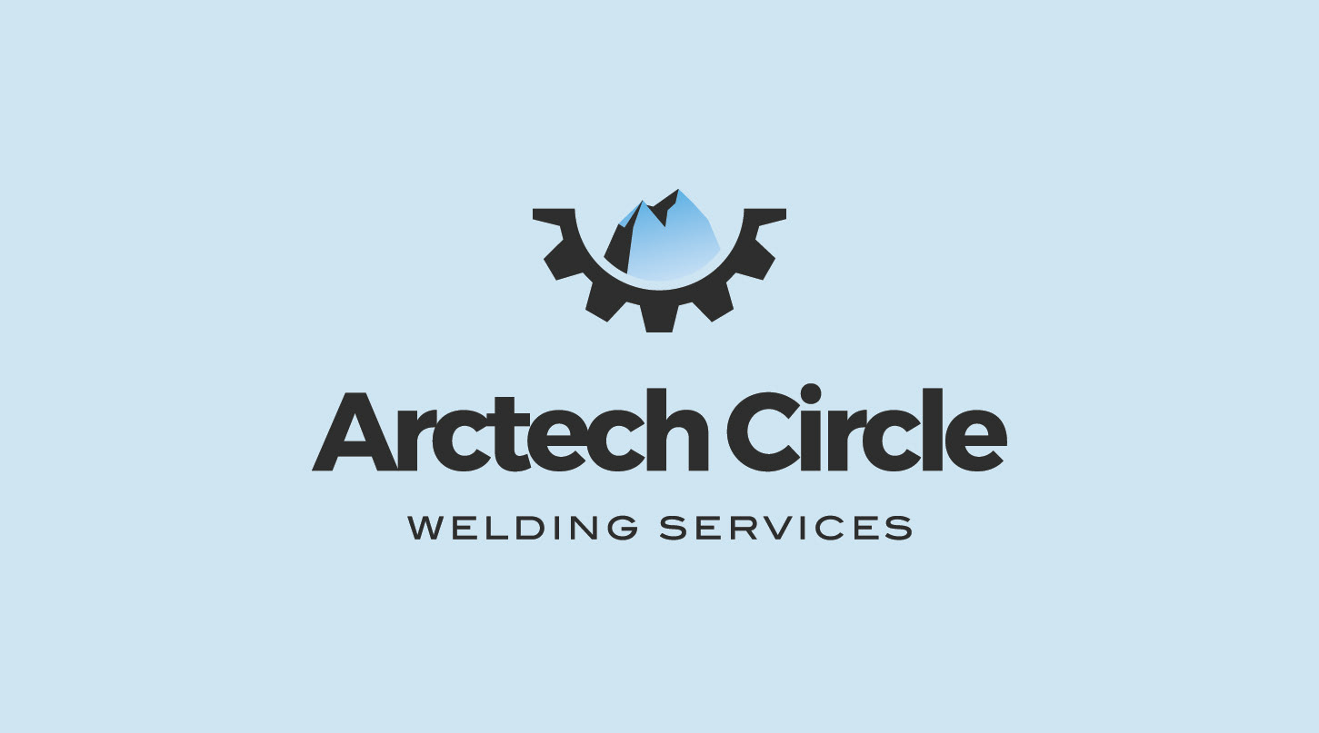
Arctech Circle Welding Services
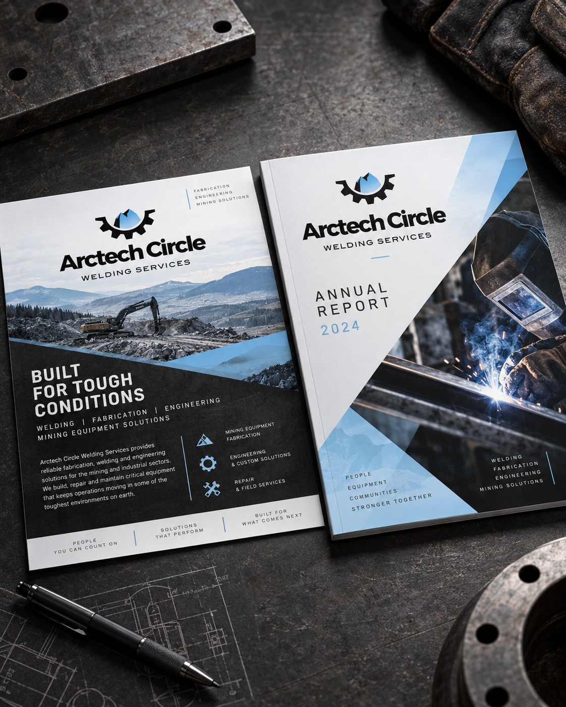
For Arctech Circle Welding Services, the brand was designed to feel strong, technical and dependable, reflecting the company’s work across welding, fabrication, engineering and mining environments.
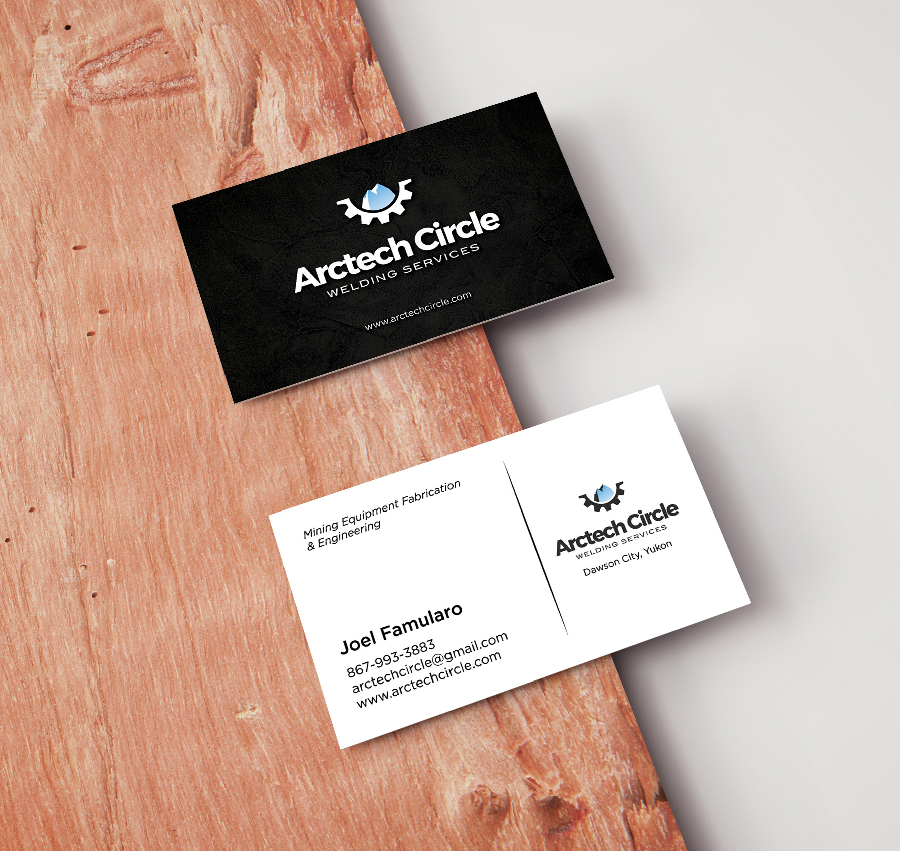
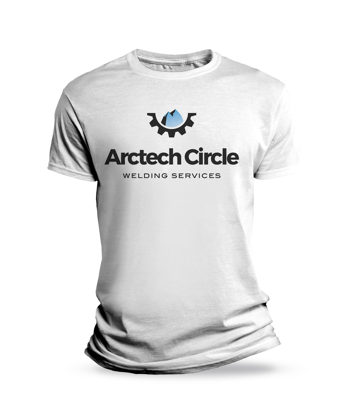
The logo combines an industrial gear form with a stylized blue mountain element, creating a mark that connects machinery, fabrication and the rugged environments the company works within. Paired with a bold sans serif wordmark, the identity feels modern and professional while maintaining the weight and durability expected from an industrial brand.
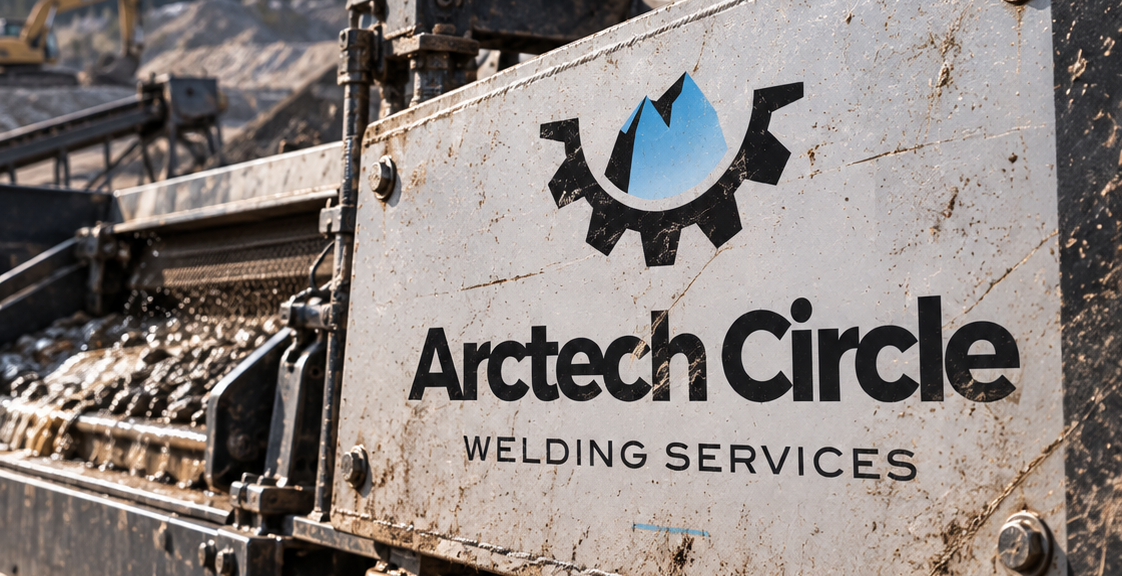
The colour palette was intentionally restrained, using black, white, charcoal and steel blue to reinforce a sense of precision and reliability. The blue accent adds contrast and gives the brand a recognizable visual signature without taking away from the utilitarian aesthetic.
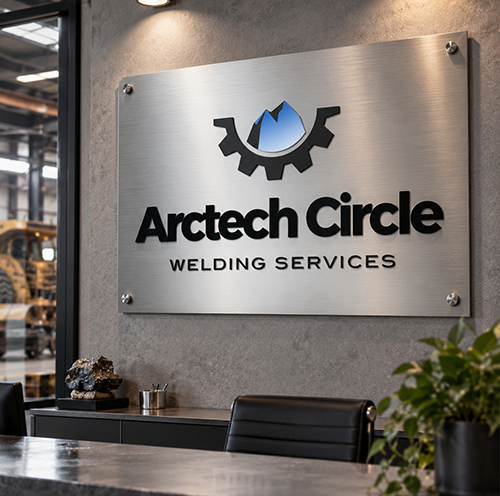
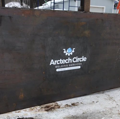
The identity was designed to translate across both corporate and highly practical applications, from reports, one pagers and business materials to office signage, workwear and equipment decals. The result is a flexible visual system that feels equally appropriate in a boardroom, fabrication shop or active mining environment.