Salon La Blonde
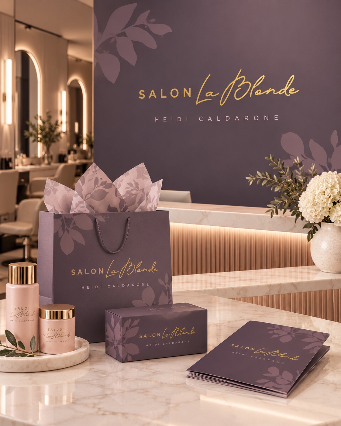
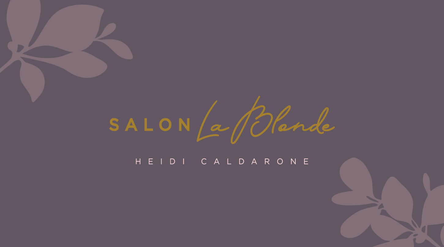
For Salon La Blonde, the goal was to create an identity that felt elevated and feminine without becoming overly delicate or traditional. The design needed to reflect the polished experience of a boutique salon while still feeling personal, warm and approachable.
The logo was built around contrast. Clean, widely spaced typography gives the word “SALON” structure and sophistication, while the handwritten “La Blonde” script introduces movement and personality. Heidi Caldarone’s name was kept understated beneath the main mark, giving the overall identity a more editorial, luxury feel.
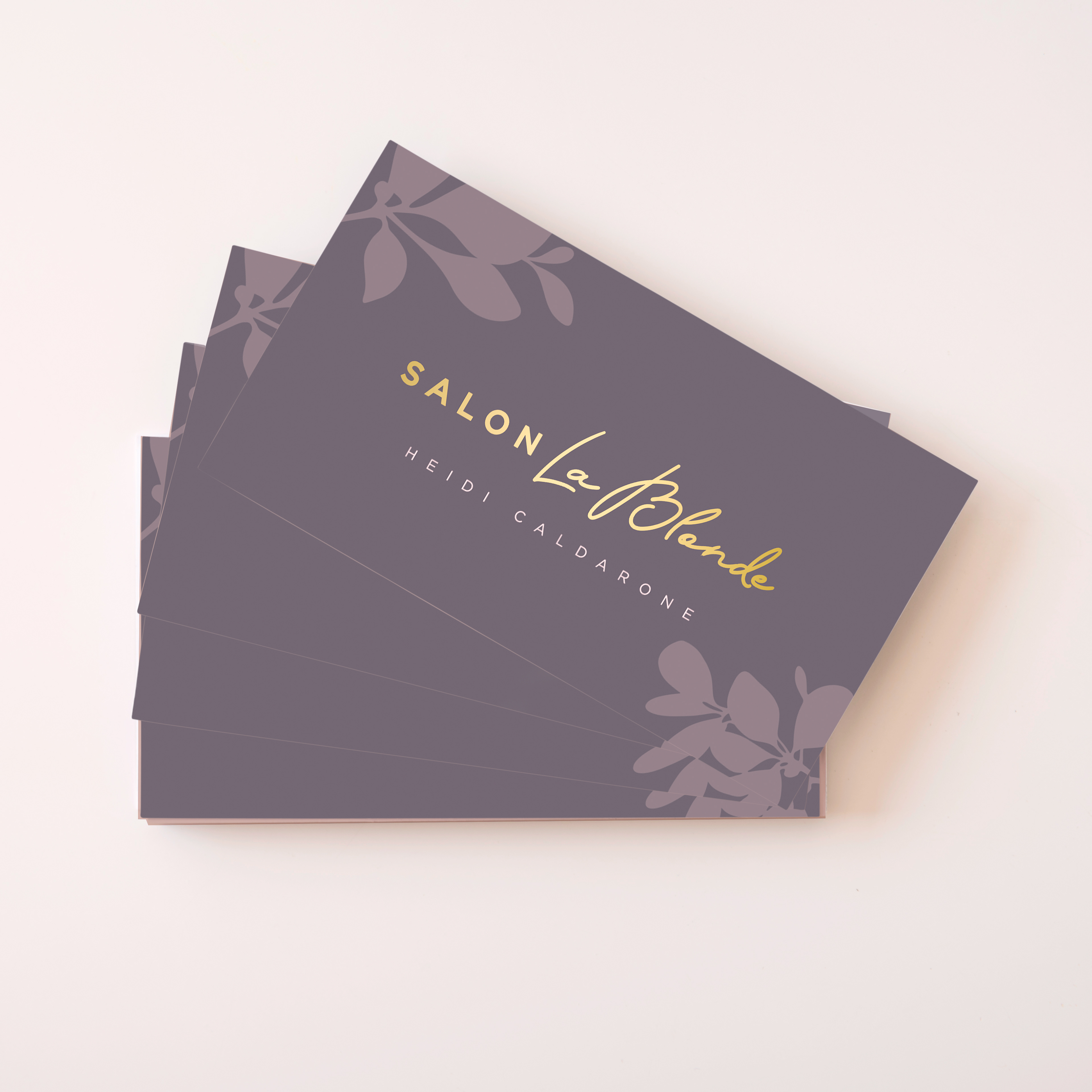
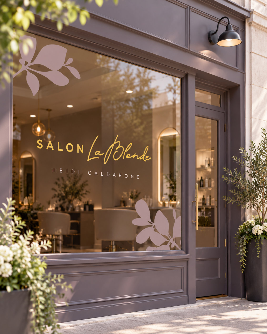
The colour palette was intentionally muted, using deep mauve as a sophisticated foundation with soft blush tones and warm gold accents. Botanical graphics were developed as a subtle supporting element, adding softness and femininity while giving the brand additional visual language beyond the logo itself.
From the beginning, I considered how the identity would translate across the full client experience. The system was designed to work consistently across business cards, appointment cards, gift certificates, with potential for storefront signage and salon collateral, creating a cohesive brand that feels considered at every touchpoint. Simple, elegant, timeless.